How to animate height based on content in React
I've been in situations where I need to smoothly animate the height of an HTML element more times than I can count, and it's not always straightforward to do because CSS cannot animate an "auto" value. In situations where you somehow know ahead of time how large the element needs to be things are easy, but being in this situation is exceedingly rare due to variations in device, browser, and user settings.
Some libraries like react-spring can help out here, but if you aren't already using them then adding another 27 kB to your bundle size for a single piece of UI is a tall order. You've only got 170 kB to play with, after all.
Just before I left Kwotimation, I was responsible for implementing a redesign of their subscription flow and part of the new UI involved a modal which dynamically resized based on its contents. The approach I took is fairly generic, and can be used in a variety of different contexts.
The UI
Here's what we're building:
Privacy warning
YouTube (owned by Google) doesn't let you watch videos anonymously. Please review my privacy policy to learn more.
Subscribing is a three step process in which the user selects their subscription plan, chooses a payment method, and then confirms their selections. Once they've completed those three steps, they have access to the system.
Each step has a different vertical height, and it's really hard to know ahead of time how tall each step will be because you'll notice that on step 2 the different payment options are displayed using an accordion. Expanding the accordion for paying by card reveals a form which takes in the user's card details, which will obviously be taller than the Apple Pay option which doesn't need to take in any user details at all.
In addition to the height animation, there's another animation that plays which fades and translates out the current step, and which fades and translates in the next step. We're going to focus on that height animation.
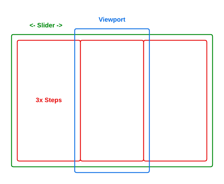
The architecture
There are three important kinds of HTML element we need to render to achieve this UI:
- The viewport is the root element, and is what the user sees when interacting with the UI. It has
overflow: hiddenset in order to hide content outside of its bounding box. - The slider which is a child of the viewport. The slider has a horizontal transform applied to it which allows us to "slide" between different steps.
- Step elements which are children of the slider. These are our individual plan, payment method, and confirmation UIs.
Diagrammed out, the architecture looks a bit like this:
Implementing it!
A really basic skeleton might look something like the following:
const STEP_COUNT = 3;
const STEP_WIDTH = 250; // px

const Viewport = styled.div`
  overflow: hidden;
  transition: .3s height;
  width: ${STEP_WIDTH}px;
`;

const Slider = styled.div`
  display: flex;
  flex-direction: row;
  transform: translateX(0);
  transition: .3s transform;
  width: ${STEP_WIDTH * STEP_COUNT}px;
`;

const Step = styled.div`
  height: fit-content;
  width: ${STEP_WIDTH}px;
`;

const AnimatedHeight = () => {
  return (
    <Viewport>
      <Slider>
        {[1, 2, 3].map((n, index) => (
          <Step key={index}>Step #{n}</Step>
        ))}
      </Slider>
    </Viewport>
  );
};
If we render our application, we'll see the text for Step #1, and if we play around with the web inspector we'll see our other slides are hidden as they're outside of the bounding box of our Slider.
We can scroll between our various steps by adding some state to keep track of which step we're currently showing, and a transform to move the correct step into our viewport element:
const STEP_COUNT = 3;
const STEP_WIDTH = 250; // px

const Viewport = styled.div`
  overflow: hidden;
  transition: .3s height;
  width: ${STEP_WIDTH}px;
`;

const Slider = styled.div`
  display: flex;
  flex-direction: row;
  transform: translateX(0);
  transition: .3s transform;
  width: ${STEP_WIDTH * STEP_COUNT}px;
`;

const Step = styled.div`
  height: fit-content;
  width: ${STEP_WIDTH}px;
`;

const AnimatedHeight = () => {
  const [stepIndex, setStepIndex] = useState(1);

  return (
    <Viewport>
      <Slider style={{
        transform: `translateX(-${stepIndex * 100}%)`,
      }}>
        {[1, 2, 3].map((n, index) => (
          <Step key={index}>Step #{n}</Step>
        ))}
      </Slider>
    </Viewport>
  );
};
At this point we're able to scroll between our views, but we're not yet animating the height of the viewport. If you're running the example code things look okay because all of our steps have identical heights, but in a real world scenario where the height of each step is slightly different we'll wind up rendering a bunch of empty space beneath the shorter steps. It's not a great user experience.
The crux of the issue is that plain CSS can't transition properties with a value of auto. In order to transition the height of our viewport in order to hide that empty space, we'll need to apply some concrete height values to our viewport's styles.
Fortunately React refs give us a mechanism for retrieving a reference to a DOM node, and from there we can trivially look up the height of the node. While typically refs are used to hold a reference to a single node or other value, there's nothing stopping us from storing an array inside a ref and stashing a number of different nodes inside that array:
const AnimatedHeight = () => {
  const stepEls = useRef([]);
  const [stepIndex, setStepIndex] = useState(1);

  return (
    <Viewport>
      <Slider style={{
        transform: `translateX(-${stepIndex * 100}%)`,
      }}>
        {[1, 2, 3].map((n, index) => (
          <Step key={index} ref={(el) => (stepEls.current[index] = el)}>
            Step #{n}
          </Step>
        ))}
      </Slider>
    </Viewport>
  );
};
Note that in reality, you'd likely want to abstract over this as assigning directly to array indexes is fairly ugly. At Kwotimation we had a hook named useRefList which papered over the ugly (and added some safeguards), and we used it in multiple locations for both height animation and focus management inside data tables--having references to cells and rows by index is really handy for that.
We can verify we've storing refs correctly by opening up the React devtools and inspecting the value of our useRef hook, and once we've verified that part's working it's really easy to pull out a height value we can use for animation purposes:
const AnimatedHeight = () => {
  const stepEls = useRef([]);
  const [stepIndex, setStepIndex] = useState(1);

  return (
    <Viewport style={{
      height: stepEls.current[stepIndex]?.offsetHeight ?? 'fit-content',
    }}>
      <Slider style={{
        transform: `translateX(-${stepIndex * 100}%)`,
      }}>
        {[1, 2, 3].map((n, index) => (
          <Step key={index} ref={(el) => (stepEls.current[index] = el)}>Step #{n}</Step>
        ))}
      </Slider>
    </Viewport>
  );
};
A little unwieldy? Yes--but the power of React lies in its ability to easily compose components together. You can easily imagine a variant of this component where the step components are passed in via a prop, and because all you need is a reference to some DOM node that contains the rendered component it means that our AnimatedHeight component doesn't actually need to know anything about what's being rendered. It can be made completely and totally reusable.
You can see some fully working example code in this GitHub repository.