Give us a contrast ratio media query!
I previously wrote about on the untimely demise of the CSS color-mod function, and the negative effects its removal from CSS Color Module Level 4 has for web developers and users all over the world. I mentioned it would be fantastic if someone were to champion color-mod with improved syntax because of how useful that function would be, and today I'm going to write about something else that would be phenomenally useful to have in CSS.
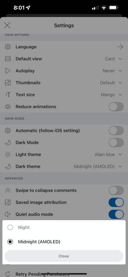
Check out the following screenshot from the Reddit app:

See those two theme options at the bottom of the screen called "Night" and "Midnight (AMOLED)"? The default Reddit app theme--Night--uses dark saturated grays for its background colors, while the "Midnight (AMOLED)" theme uses pure black. By pure black, I mean #000 and not "it looks black on an IPS display." It's the level of black which Ian Storm Taylor of Segment fame says you should never use.
Ian's advice is awesome. Dark grays with some brand colors mixed in look awesome, and are absolutely what you should generally be using when designing your user interfaces. Pure black is harsh, and can dominate your interface if it isn't used well.
But something major happened between when Ian published his article in 2012 and today, and that is the proliferation of mobile devices with displays using OLED technology. OLED has three big advantages compared to the displays of yesteryear:
- Each pixel is individually lit, which means that when you render #000 the pixel is perfectly black with no visible backlight.
- Because of the above, using dark colors reduces the battery consumption of your user interface. Substantially so.
- Also because of 1), using an OLED screen late at night is much better for your eyes because you're taking in less light from your screen.
The difference in power consumption between a dark gray pixel and a black pixel is, of course, a lot slimmer (ignore the clickbait title on that article) than the difference between a black pixel and a white pixel. The power consumption of an OLED pixel depends upon its luminance, and of course its luminance is in turn determined by the exact color you're trying to output.
And honestly, pure black looks awesome on an OLED display. The Apple Watch uses pure black judiciously all throughout the system, and I can only assume part of the reason for that (aside from battery life) is because it looks incredible.
When I'm scrolling through an app on my iPhone which uses a pure black background, I find myself in wonderment as the display literally just fades into the background. With the human eye, you cannot spot where the edge of the display meets the bezel because the background of the app and the bezel are exactly the same color. It feels really good. The issue of OLED smearing is greatly reduced with the new ProMotion displays on the iPhone 13 Pro models, too.
It would be fantastic if we could somehow determine in CSS whether the user is using display technology which can render a true, inky black. @media screen and (is: oled) feels limiting--what about MiniLED on the iPad and MacBooks, or the MicroLED in Samsung's Neo G9 monitor? But we could have a min-contrast-ratio query in the same vein as min-width.
The closest thing we have right now is the dynamic-range media query, but this doesn't get us all the way there as it takes into account things like maximum display brightness in addition to contrast ratio. It is, after all, a query designed to tell you whether the user's monitor supports HDR and not a query for contrast ratio.
A contrast ratio media query would let us build fantastic dark mode themes for today's display technology. Even if you aren't a fan of true black like I am, you can get away with darker grays on an OLED screen than you can on backlit displays. Not only do these OLED-aware themes look fantastic, but they're also slightly more ecological and better for user health.
It's a win-win-win, and I want it bad.