On the updated Philips Hue app
I have a lot of Philips Hue bulbs set up in my workspace as they look fantastic and there's a decently large body of research connecting lighting to mood and productivity. Until recently I've had nothing but good experiences with my bulbs -- which I expect, given how much more expensive the Hue brand is compared to its competitors. That changed earlier this week when my phone downloaded the "new and improved" Philips Hue app.
I tend to avoid speaking poorly about others' work, but the new Hue app is really bad and a great example of how UI and UX are completely separate facets of a product. I personally find the new UI much more pleasant -- the typography is crisp, shadows have been strategically added in order to create hierarchy, and screens feel like they aren't so densely populated anymore. The actual experience of using the new app, on the other hand, is downright awful.
Every single time I open the app -- even if I quickly duck out and back in to check a text message -- I'm presented with the following screen.
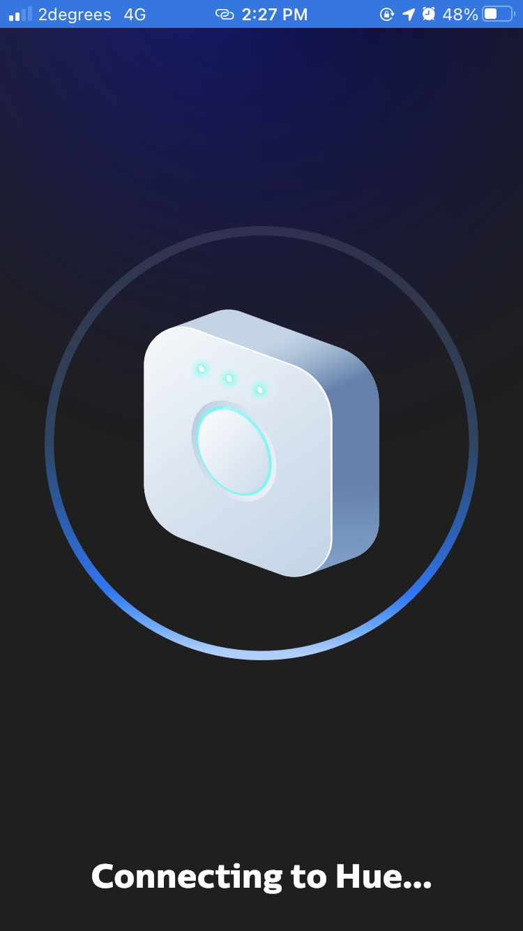
Before the update, the "connecting to Hue" message displayed in a little banner at the bottom of the screen, and I was free to navigate the rest of the app while that happened. Now, however, I need to stare at a loading screen before I can do anything.
Interacting with my lights feels flaky, too. If I turn my lights on or off too soon after the loading screen disappears then nothing happens. The only fix in this case is to turn the lights on and off (or off and on) again so that my changes will actually take effect. I have never had this happen to me prior to the release of the new app, and it is really annoying. The most basic form of interaction a person has with a light bulb is to toggle its power and the new app has made the interaction take longer (because of the new, full-screen loading message) in addition to being less reliable! It's like using a toaster that has a 50% probability of stubbornly popping your bread back up. I want my toaster to toast bread, and I want my lights to turn on and off without any ceremony.
Supposedly the new app has been rebuilt from the ground up, so it's possible that the excessive loading screens and unreliable light controls have simply gotten through QA due to an edge case with my setup. But it's hard for me to be charitable with Philips because of how genuinely miserable the new interface is to use.
Previously, my lights and scenes were displayed in a vertical list. Vertical lists make sense on mobile devices because their screens are taller than they are wide (the Hue app has never had a widescreen layout), and the added physical space makes scrolling with your finger easier as you need to reset your finger position fewer times. It's actually really hard for me to think of an app which relies on users scrolling horizontally in a portrait mode, because the obvious mode of operation is to scroll vertically.

Or at least, it's hard for me to think of an app apart from Philips Hue. Because a designer decided to replace my vertical list of lights and scenes with horizontally scrollable grids instead. Getting to the end of my scenes takes about 2 1/2 scrolls with my thumb now, whereas previously I could do it with one. The tap targets are slightly smaller now, too, which means a). I need to be slightly more precise with my fingers and b). there's no room on the screen for me to adjust individual light brightness. Before this update, I could activate a scene and then adjust brightness on a light-by-light basis efficiently. Whereas now I need to click into the light I want to adjust before I'm able to adjust brightness.
I really dislike the new app. While it does look rather pretty, the improved aesthetics have come at the cost of my workflow. I invested in Hue because it was billed as a premium lighting solution that works out of the box without any hassle. If the Hue team did any usability testing prior to shipping this app, it doesn't show at all -- the new interaction design is a significant regression from the previous iteration, and I'm far from the only person who thinks that if you look at the app's recent reviews. I really do think that the designers who dreamt up this new interface and the product manager that approved it have really dropped the ball with this update, and it's a shame because I found the Hue system utterly perfect beforehand.

In the grand scheme of things, this isn't the end of the world. Even if Philips never touches the app again, I'll still use my bulbs and deal with the added friction (although I'll find it harder to recommend them). I'm writing this article because this isn't the first app in the world that has been made worse by unnecessary tampering and it certainly won't be the last. When it comes to designing and developing software it can be hard to resist the urge to tweak things, but it's so incredibly important to exercise restraint. User workflows matter and pushing poorly thought out changes to the world makes your product worse -- nobody wants to do that, but it's what happens in the real world without processes and restraint.