Apple and the value of small details
There is an absolutely fantastic Medium article from 2018 discussing the shape of the iPhone's notch. While you might think that it's just a plain old rectangle with rounded corners, there's more to this controversial piece of industrial design than meets the eye. The notch is actually made up of four squircles--very similar to a plain rounded rectangle, but with one crucial difference.
On each side of the notch are two curved corners which meld seamlessly into each other. If you draw tangent lines across the curve, none of those lines will be perfectly vertical because the curve you start from doesn't finish before the next one starts. Plain rounded corners like the ones you get from the border-radius CSS property wouldn't achieve this perfect transition.
The difference this makes to the iPhone's appearance is subtle but hard to unsee.
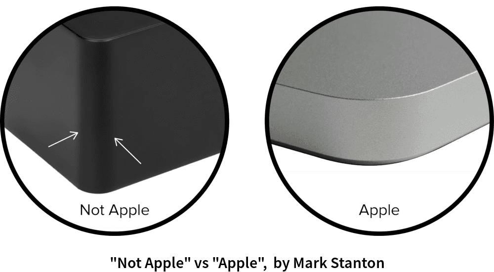
And if you look a little deeper, you'll notice that iOS icons are also squircles. And you'll also notice that the outline of all of Apple's devices are also squircles. That last one is easy to see if you hold up a MacBook or iPhone to the light--the corner of the device won't show the harsh shift in highlight that you might expect from another manufacturer's devices.

Most companies don't really care about small details like these--and most companies also wind up failing. Getting the little things right can have huge upside for a business, and Apple are arguably the best company in the world at dialing in all of the different aspects of their product in order to produce something that's both beautiful and works really well.
Truthfully, Apple isn't really known for its innovation--aside from the iPhone, none of their products have been truly "new," and they're always infamously late when it comes to adding new features. It took them about 2 years to add copy/paste to the iPhone, and only the Pro models of the iPhone 13 have a high refresh rate screen--something Android phones have had since 2018. This might seem baffling to tech enthusiasts, but Apple's slow rate of feature additions is a tactical decision which is crucial to their success.
They're obsessed with building the best version of a feature, and not just churning out features for the sake of it. The folks buying from Apple aren't electrical engineers scrutinizing a specs sheet: they're regular everyday folk looking for something that will solve a problem in their life. While Apple's products might be expensive and lack features compared to their competition, they're also rock solid, beautifully designed, long lasting, and do what they say on the tin.
In the words of Daniel Hansson: "Always build less, always build at full quality. Scope moves, quality doesn’t."